Pavilions of splendour
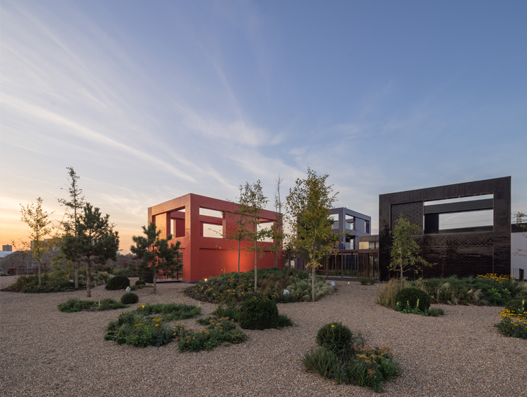
Ballymore has taken the workaday housebuilder’s marketing suite and created some little triumphs of temporary architecture, says Will Wiles. Like the celebrated Apple Stores, where stunning design has made them such a retail success, Ballymore wants its marketing pavilions to be intriguing, inviting spaces and emblems of a reassuring, perfectionist ethos that permeates all its developments. Roger Black, Ballymore’s creative director explains the thinking behind the company’s pavilion for City Island, a riverside neighbourhood of 1700 homes. “What we wanted to do was not fight the fact that it’s a construction site, but actually celebrate it”, he says. The visitor approaches by a carefully choreographed black-lined route. “All of a sudden you’re transformed, you see this beautiful jewel of a building surrounded by landscaping, but you also see all the construction around it as well”, he adds. And like Apple Stores, which each offer their own look, each building is different according to its setting. Once inside, the spaces are carefully designed to set the visitor at ease while offering an element of surprise and engagement.
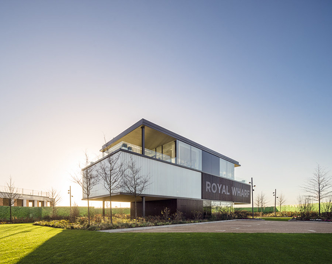
Royal Wharf marketing suite
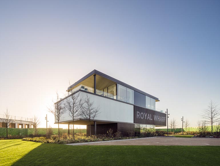
Opened in October 2015, Royal Wharf’s sales pavilion is an elegant, minimal box in dark metal and clear and frosted glass, crisp in the day and glowing after dark, set in landscaped grounds. The drama comes when potential purchasers arrive at the top level, which has meeting spaces and breathtaking views up and down the Thames. “It has the aesthetic of being a beach house on the waterfront, it’s a beautiful modernist pavilion in the same genre as the likes of Philip Johnson or Corbusier,” says Black.
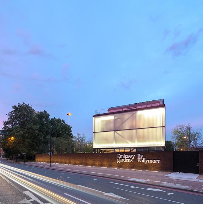
Embassy Gardens marketing suite
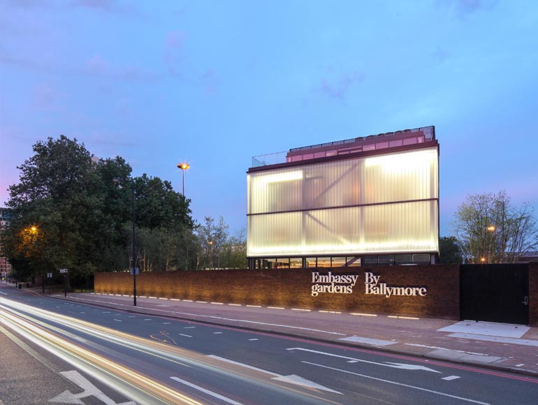
The pavilion for Embassy Gardens is set in a difficult landscape- a dual carriageway threading through a post-industrial wilderness undergoing, noisy, dusty transformation. Architect Hal Currey who has designed all Ballymore’s pavilions in collaboration with Arup Associates says: “We had this idea of a beacon, as prominent in the night as it is in the day, a lit box along quite hostile Nine Elms Way”. To create this tranquil oasis, a tall brick wall separates the building from the road – “a classic English garden wall,” says Black – and a heavy gate leads to an elevated pathway through an attractive garden of dune grasses and wild flowers. Within this garden is the marketing suite, which the path guides people past, and then towards, “so you get to see this beautiful glass cube within the setting for as long as possible” Black adds. Inside, another play of concealment and revelation takes place. The show apartments are behind frosted glass, so light comes in but there are no views. Again, those are saved for the top level, 12 metres up, from where the Thames can be best enjoyed. Will Wiles is an author and architecture writer. Pavilions photography credit: HAL Photographer: Simon Kennedy

